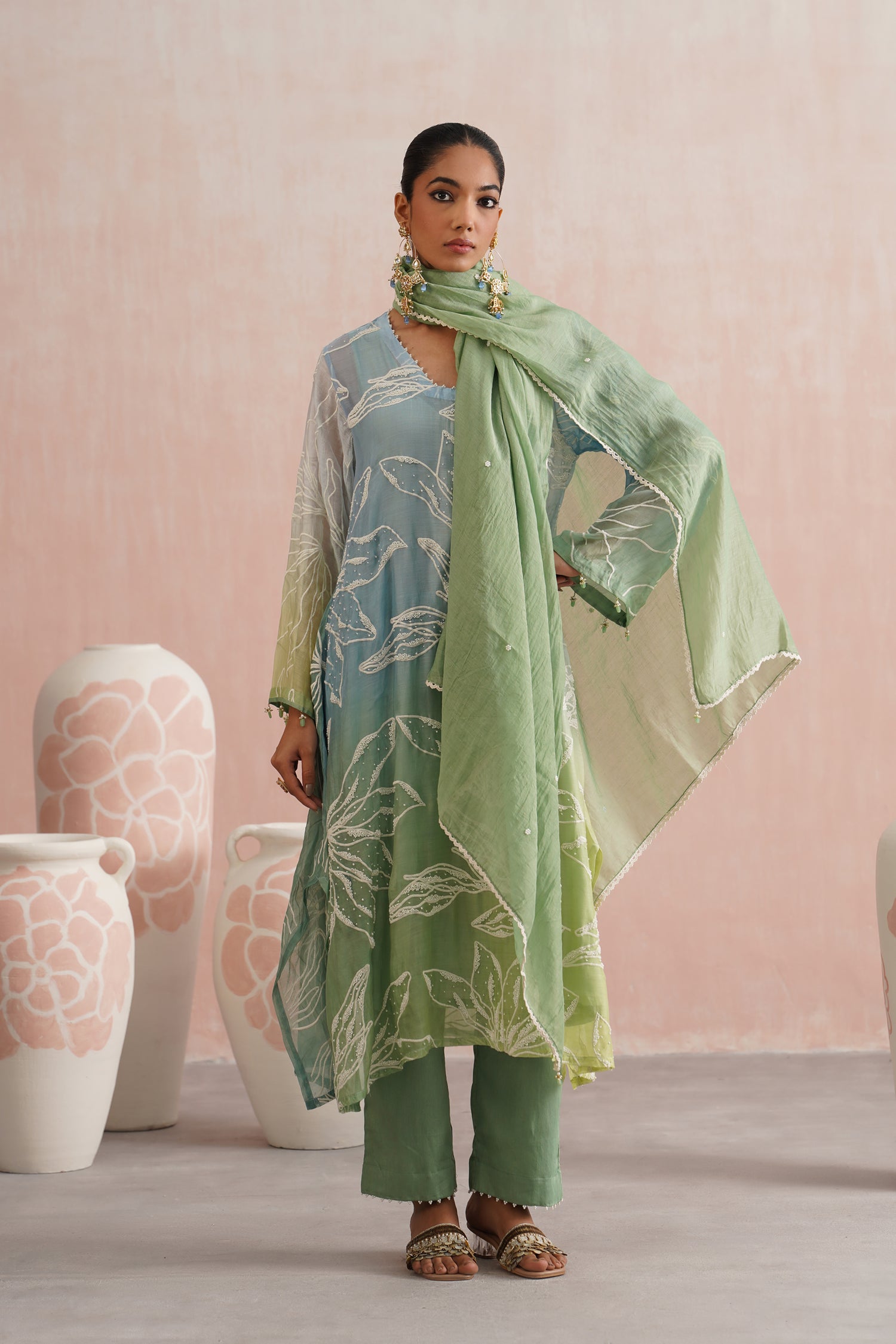

How Colour Palettes Shape a Festive Collection

Shop now Kudmayi -The Trousseau Edit
When we think about festive clothing, embroidery and silhouettes often come to mind first. Yet one of the most powerful elements shaping a collection appears much earlier in the design process: colour.
Before a garment is sketched or a motif is embroidered, designers often begin with a colour story. A palette helps define the mood of a collection, whether it feels soft and romantic, vibrant and celebratory, or calm and timeless. The colours chosen influence how fabrics are selected, how embroidery is placed and how different pieces relate to each other.
For brands that focus on thoughtful, wearable occasion wear, colour becomes an important way of creating harmony across an entire collection.
The Starting Point: A Mood or Inspiration
Most festive collections begin with a broader inspiration. It might come from nature, architecture, textiles, art or even a particular season.
Once that inspiration is identified, colours begin to emerge naturally from it. Designers start selecting shades that capture the emotion they want the collection to convey. These colours often become the foundation upon which the entire collection is built.
In collections like Roz Meher, for instance, soft florals and gentle pastels play an important role in shaping the visual identity of the garments. These tones feel light, romantic and well-suited to daytime celebrations.

Pieces such as the Inaaya Set reflect this mood beautifully. The colour palette feels delicate and serene, allowing the embroidery and silhouette to feel elegant without becoming overwhelming.
When a collection begins with a clear colour story, every piece naturally feels connected to the others.
Balancing Statement Colours and Soft Neutrals
A successful festive collection rarely relies on a single colour family. Instead, designers often create a balance between stronger hues and softer neutrals.
Rich colours help certain garments stand out, while lighter shades allow others to feel more relaxed and wearable. This contrast ensures that the collection appeals to a variety of occasions and personal styles.
For example, deeper tones such as jewel-toned blues and greens bring a sense of celebration and presence. The Feroza Set, with its rich hue and intricate detailing, illustrates how a bold colour can create a striking festive statement while still feeling refined and wearable across occasions.

Shop Now Feroza Set
At the same time, softer tones provide visual breathing space within a collection. Ivory, blush, and muted pastels often appear in lighter silhouettes, allowing these garments to feel versatile and timeless.
 Shop Now Zeenat Set
The Zeenat Set, with its softer palette and delicate embroidery, demonstrates how neutral tones can still feel festive through texture and detailing rather than intensity of colour.
This balance between vibrant and understated shades allows a collection to feel both cohesive and thoughtfully varied.
How Colour Influences Fabric Choice
Colour palettes also guide the selection of fabrics. Certain textiles respond differently to colour depending on their weave, sheen and texture.
For instance, fabrics like tissue silk reflect light beautifully, which makes metallic tones appear especially luminous. In pieces like the Rani Set, the soft gold-toned tissue dupatta interacts with the gentle sheen of the fabric, creating a glow that feels festive yet easy to wear, without appearing heavy.
 Shop Now Rani Set
Mul Chanderi and Chanderi silk, on the other hand, often work beautifully with softer pastel palettes. Their semi-sheer texture diffuses colour gently, creating a delicate visual effect that suits daytime festivities and warmer seasons.
This relationship between fabric and colour is carefully considered during the design process. The same shade may appear very different depending on the textile it is applied to.
Creating Visual Flow Across a Collection
Another important role of colour palettes is to create flow across an entire collection.
Even when individual garments vary in silhouette or embroidery style, a shared colour story ties them together visually. This ensures that each piece feels like part of the same narrative.
For instance, when floral-inspired tones such as blush pinks, soft greens and muted pastels appear across multiple pieces, they subtly echo one another. A kurta set, a lehenga and a saree may look completely different in construction, yet still feel connected through their colours.
This visual continuity helps collections feel thoughtfully curated rather than randomly assembled.
 Shop Now Ruhani Set
Pieces such as the Ruhani Set, with its soft pastel base and delicately contrasted dupatta, illustrate how colour can carry a gentle, floral-inspired narrative throughout the garment itself.
 Shop now Saira Set
 Shop now Mehar Set
Colours That Work Beyond the Occasion
Another consideration for designers today is longevity. Many people now prefer festive outfits that can be worn across multiple occasions rather than only once.
Colour plays a key role in achieving this versatility. While extremely trend-driven shades may feel striking initially, softer or timeless palettes often allow garments to remain relevant for years.
Ivory, muted golds, soft greens and delicate pastels tend to age gracefully, making them easier to rewear for different celebrations.
Because of this, collections often combine statement pieces with quieter colour options. This gives wearers the flexibility to choose garments that align with their personal style and lifestyle.
More Than Just Aesthetic
 Shop now Swara Set
Ultimately, colour palettes do far more than make a collection visually appealing. They shape the emotional tone of the garments, influence fabric selection and determine how different pieces interact with each other.
When thoughtfully designed, a colour story allows a collection to feel cohesive while still offering variety. It ensures that every garment contributes to a larger narrative rather than standing alone.
In collections that emphasise craftsmanship and thoughtful design, colour becomes an invisible thread tying everything together.
Because sometimes, before a garment is ever stitched or embroidered, the story of the collection has already begun, in colour.